
Appearance
Anchors
An anchor decides where and how your content attaches to the real world – pinned to a spot in front of the user, snapped to a detected table, following the camera, riding along on a hand, or appearing on top of a recognized image.
Anchoring is set on the object you select – the root node in the hierarchy, which carries the anchor and shows its current Anchor Type. An object holds its visual content inside it: a 3D model, visual media, a UI panel, and so on. Select the object (not the content nested inside it) and the Anchoring panel appears. To anchor several objects together, group them into a Container and anchor that.
Name everything you add
Give clear names to your objects, containers, and the models inside them. As scenes grow, good names are what keep everything findable and easy to reference.
Choosing an anchor
The available anchor types depend on the experience's tracking context (chosen when you create the experience). Select a context below to see which anchors it offers:
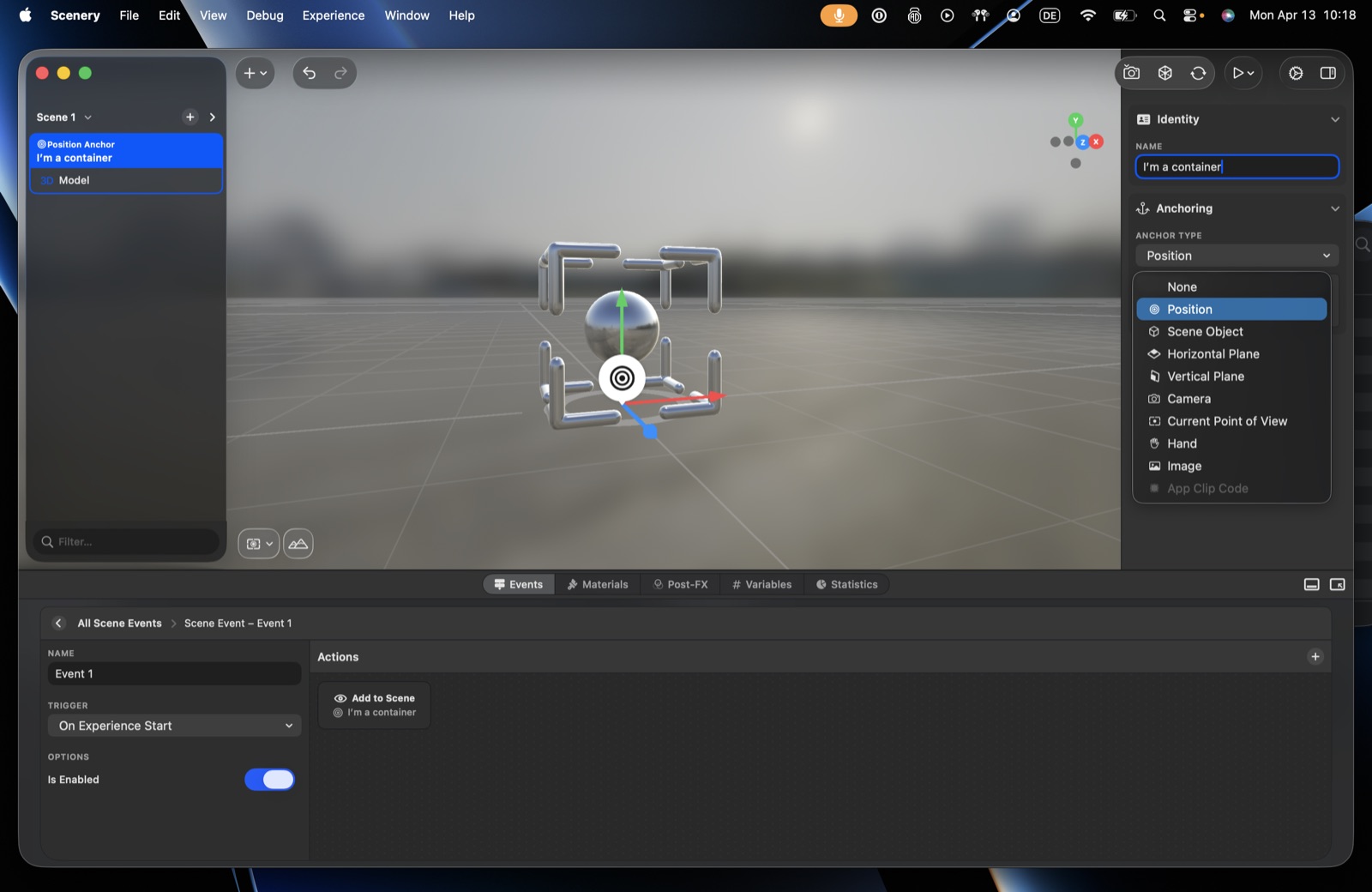 The Anchor Type menu in a world-tracking experience.
- Position – a fixed spot in the scene
- Scene Object – follows another object in the scene
- Horizontal / Vertical Plane – snaps to a detected real-world surface
- Camera – stays attached to the camera
- Current Point of View – placed once at the user's viewpoint
- Hand – attached to the user's hand (Apple Vision Pro)
- Image – appears on a recognized image
Playspace experiences offer the same set. Screen Space is also available for User Interface elements.
(App Clip Code appears greyed-out – it isn't author-selectable. Screen Space appears only for User Interface elements – see Screen Space.)
Placing objects well
- Anchor first, then nudge. An anchor sets an object's base position. To fine-tune from there, don't fight the anchor – use the object's Transform (position, rotation, scale) to nudge it into place on top of its anchor.
- Nudge the object, not its content. The object is the root that carries the anchor; its visual content – a 3D model, media, or UI – sits inside it. To fine-tune placement, move the object itself rather than the content within it, since tracking comes from the object's position.
Position
The default. The object has a fixed position in the scene. Drag it with the gizmo, or type the X / Y / Z values directly.
Scene Object
Anchor an object to another object in the scene, so it tracks that object instead of having a position of its own.
- Target – the object to follow.
- Lock translation / rotation / scale – independently per axis (X, Y, Z).
- Offset – a transform applied relative to the target.
- Update continuously – when on, it keeps following the target as it moves; when off, it snaps once.
- Transition smoothing – see below.
Horizontal & Vertical Plane
Place content on a real surface the device detects. Pick Horizontal Plane or Vertical Plane, and the options adapt.
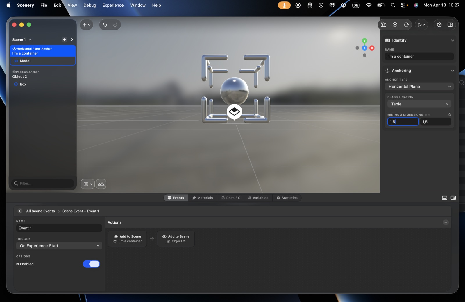 A Horizontal Plane anchor – surface type and minimum size.
Surface type
Instead of "any surface," require a specific kind of surface. The choices depend on orientation:
| Orientation | Surface types |
|---|---|
| Horizontal | Floor, Ceiling, Table, Seat |
| Vertical | Wall, Window, Door |
Surface types let content fit its setting – a character that only appears on a Table, signage that only appears on a Wall. Content with a surface type set won't appear until the device finds a matching surface.
Surface types need a capable device. Recognizing what a surface is (table vs. floor vs. wall) requires an iPhone or iPad from 2018 or later (A12 chip or newer). On older devices the surface type can't be determined. (A depth sensor further improves placement accuracy but is not what enables surface types.)
Minimum size
Require the surface to be at least a certain size (in metres) before content appears. For example, a scene meant to stand on a tabletop can require a minimum table size, so it only places on a surface actually big enough to hold it.
On iPhone and iPad, Window and Door behave like Wall – there is no separate classification for them. Apple Vision Pro has both, but only uses them where the room reads that way: a plain flush door in a plain wall is normally reported as part of the wall.
Where it lands
Content appears on the surface the viewer is pointing at, so it lands where they are looking rather than on whichever surface the device happened to find first. Point at the near table and it goes there; point at the far one and it goes there instead.
This matters because a detected surface is only as big as the part that has been scanned. A wall the device has seen 70 cm of is a 70 cm surface as far as it knows, and choosing by size or distance would keep landing content on fragments. Where the viewer aims doesn't have that problem.
Two rules follow from the kind of surface:
- On a wall, the height is the viewer's own, or higher if they aimed higher. Glancing at the skirting board doesn't put a picture on the floor.
- On a ceiling, content hangs into the room. An object built standing on a table hangs from a ceiling the same way a lamp does.
Camera vs. Current Point of View
These look similar but behave differently:
- Camera – content stays attached to the camera and follows it continuously. Good for things that should stay in view, like a heads-up element or a companion character. You can give it an offset.
- Current Point of View – content is placed at a one-time snapshot of where the user is looking at that moment, then stays put. You can set an offset and reset its rotation.
Reset rotation makes the content sit upright, facing the user, ignoring any head tilt at the moment it's placed – so the content isn't skewed by how the user happened to be looking when it appeared.
Hand
Anchor content to the user's hand – a character that follows it, a panel, an object you can move or throw.
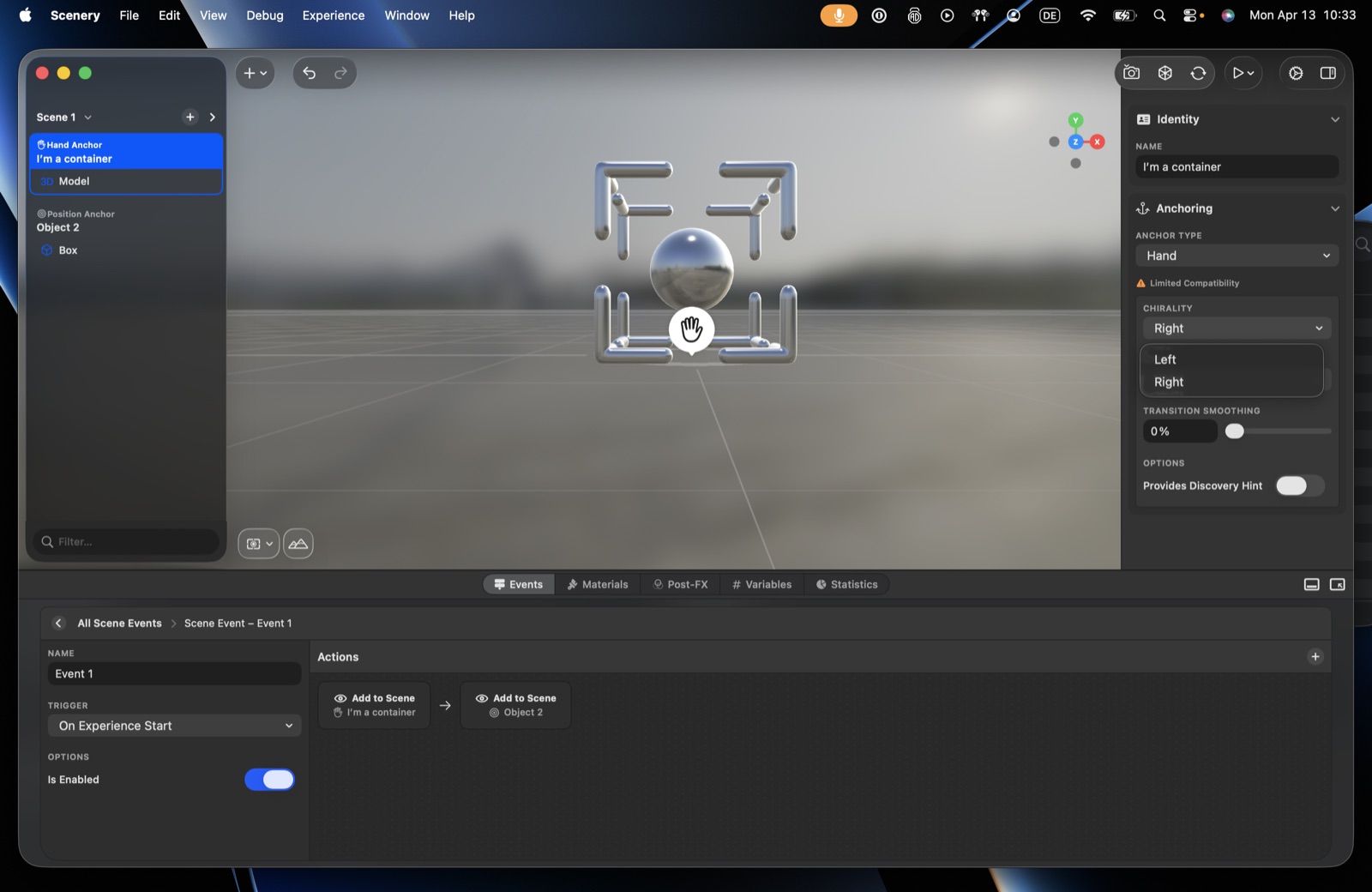 Hand anchor options.
Platform support
Hand anchoring is currently available on Apple Vision Pro only (shown as "Limited Compatibility" in the editor). Support may expand to other platforms in future.
- Hand – Left or Right.
- Joint – one of: Forearm Arm, Wrist, Thumb Tip, Index Finger Tip, Middle Finger Tip, Ring Finger Tip, Little Finger Tip.
- Transition smoothing – see below.
- Provides discovery hint – when on, prompts the user to look at their hand as content appears. Off by default.
Image
Make content appear on top of a recognized image – a poster, a postcard, a sign, a QR code. You can combine an image anchor with other anchoring in the same experience: a walk-around scene that also augments specific posters when they're seen.
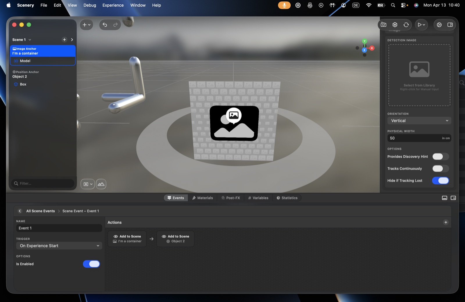 Image anchor options.
Measure the physical width accurately
The physical width tells the system how large the image is in the real world, and it uses that to judge distance – so an accurate value is crucial. Even a small error and everything you place lands at the wrong distance and scale. Measure the printed image area itself, not any surrounding border or mounting plate.
- Detection image – the reference image, from the asset library.
- Orientation – Horizontal (flat, e.g. on a table) or Vertical (on a wall, content faces outward). The marker preview updates to match.
- Physical width – the real-world width of the image, in centimetres (see the warning above).
- Provides discovery hint – prompts the user to look for the image.
- Tracks continuously – when on, content keeps following the image as it moves; when off, position is set once on first detection.
- Hide if tracking lost – when on, content disappears if the image goes out of view; when off, it stays where it was last seen.
Choosing and printing a detection image
- Detail everywhere, high contrast. Spread visual detail across the whole image, not one corner. Avoid plain repeating or symmetric patterns (grids, checkerboards) – they confuse recognition. Asymmetric artwork also keeps placed content from flipping the wrong way round. Detailed posters, signs, and QR codes all work well (a QR can double as the way into the experience).
- Matte, never glossy, and dead flat. Reflections and glare are the biggest enemy, especially outdoors; a curved or bent surface throws placement off. For a lasting outdoor marker a rigid material like a metal plate won't warp or shrink the way paper can.
- Size sets the range. Bigger images detect from farther away – a small (~5 cm) marker only works up close, so print large (A3 or bigger) to place content while standing back. Always test the finished, printed marker on-site, not just the design on screen.
Per-device anchoring (Device Configuration)
The same content often works best in different ways on different devices. Per-device anchoring exists for two main reasons:
- Better presentation per device. A user-interface panel placed in 3D space can work beautifully on a headset, while on a phone the same panel may read better as a flat Screen Space overlay. It's case-dependent – give each device whichever placement suits it best.
- Working around device-limited anchors. Some anchors are only available on certain devices – Hand anchoring is currently headset-only, for instance. Per-device anchoring lets you use it where it exists and fall back to something else (e.g. Position) where it doesn't.
The Device Configuration picker lets a single object use a different anchor per kind of device:
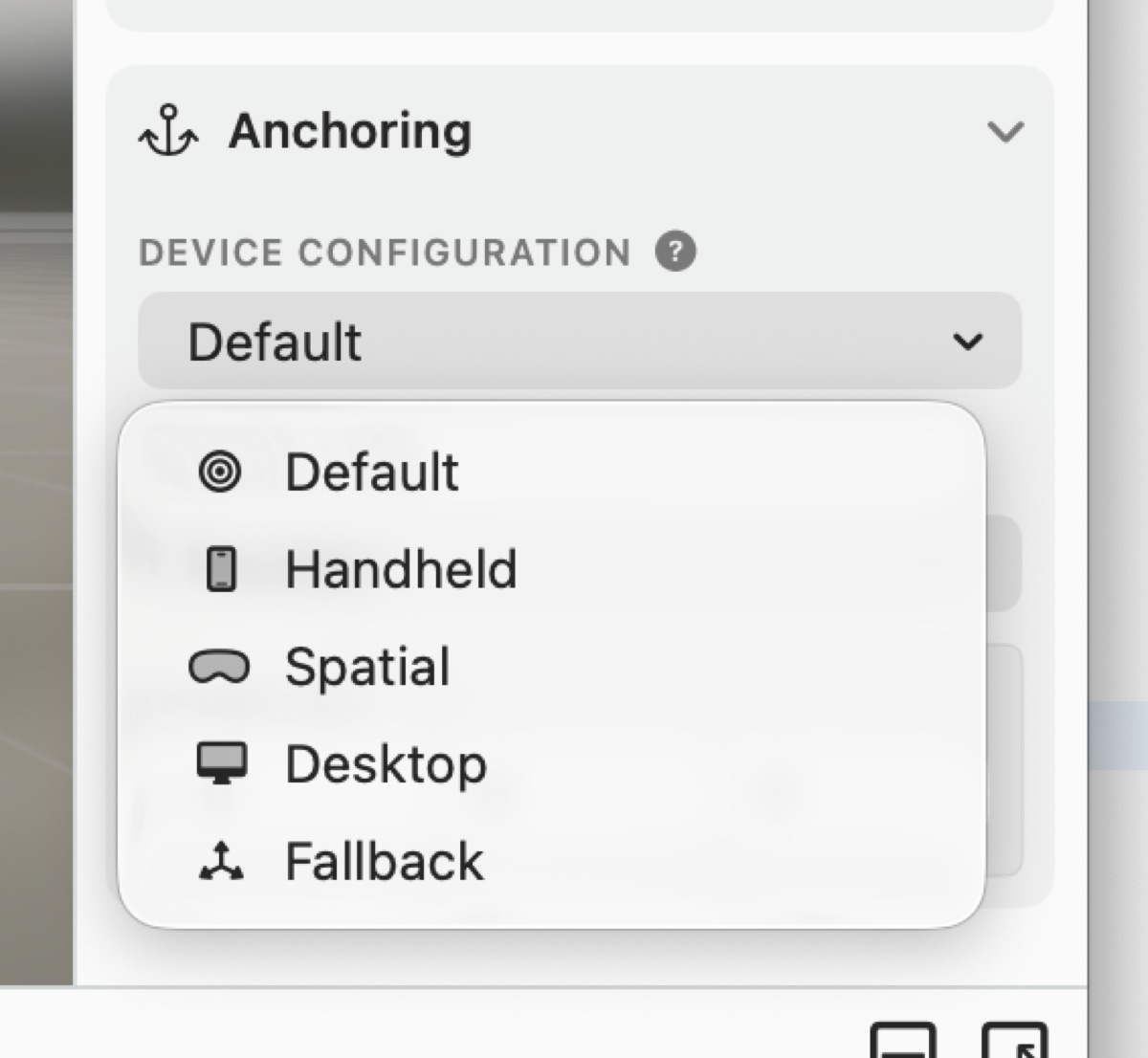 The Device Configuration picker.
- Default – the anchor used everywhere, unless overridden below.
- Handheld – phones and tablets.
- Spatial – headsets (Apple Vision Pro and similar).
- Desktop – Mac.
For each device category you can choose a different anchor, or Hidden to leave the object out entirely on that kind of device. A common pattern: Spatial → Hand, Handheld → Position – so the same object is hand-attached on a headset and placed in front of the user on a phone.
- Fallback – a fallback position used only when none of the above can be resolved on the running device (for example, the chosen anchor isn't supported there). It keeps content from disappearing by giving it a sensible default placement.
Screen Space
Available only for User Interface elements (a UI panel with no nested children). Instead of placing the panel in 3D space, Screen Space pins it as a non-spatial overlay fixed to the screen – a 2D HUD that stays in place as the camera moves. Use it for on-screen controls, titles, and other interface that shouldn't live in the world.
- Alignment – where on screen the panel sits: centre, an edge, or a corner.
- Edge insets – padding from the screen edges.
- Respects safe area – keep clear of the notch / home indicator.
Because it isn't a 3D anchor, the spatial controls (gizmo, orientation cube) are hidden while a screen-space UI is selected.
Touches behind the panel
A screen-space panel sits above the scene, so it decides what reaches the camera behind it. The panel's Material makes that call:
- Transparent – nothing is painted, so taps and drags that miss a control pass straight through to the scene. Use it for a HUD that frames the view without capturing it – a few buttons over a live camera the user can still move.
- System or Solid – the panel is a visible surface, so it absorbs those touches, the way a card or sheet does.
Controls always receive their own taps either way. Labels and shapes only capture a touch when you've given them an event – otherwise they're treated as decoration and let it through.
Transition smoothing
Several anchors (Scene Object, Hand) offer transition smoothing, shown as a percentage (0–100%). At 0%, content sticks rigidly to its target. As you raise it, content follows with a gentle lag – a more natural, "lazy" follow. Tune it to taste.